Linear model is one of the most ubiquitous stats models used in ML. It is relatively simple, intuitive, yet quite powerful when fitted to many real life problems.
If we build a linear model of the relationship between some numeric response and explanatory variables, so that we can, say, predict the response value based on explanatory variables’ values, we call this method linear regression.
Example data : exam score and assignment score
For example, we would like to know how college students’ exam score relates to their assignments score. Now we have a sample of 10 students’ scores. For each student, we have their first assignment’s score (A1 Score) and their exam score:
| Student No | A1 Score (full mark 20) | Exam Score (full mark 100) |
|---|---|---|
| 1 | 16 | 90 |
| 2 | 3 | 25 |
| 3 | 11 | 62 |
| 4 | 14 | 75 |
| 5 | 16 | 10 |
| 6 | 18 | 89 |
| 7 | 7 | 72 |
| 8 | 12 | 81 |
| 9 | 2 | 34 |
| 10 | 13 | 88 |
Often, it’s a good idea to start by looking at the plotted data, just to spot some rough pattern. We human are good at this!
import seaborn as sns
a1_scores = [16, 3, 11, 14, 16, 18, 7, 12, 2, 13]
exam_scores = [90, 25, 62, 75, 10, 89, 72, 81, 34, 88]

# Note that explanatory variable is on the X axis, while response is on the Y axis
_ = sns.scatterplot(a1_scores, exam_scores).set(
    xlabel="A1 Score", ylabel="Exam Score")
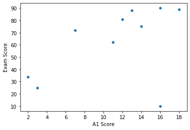
Looking at the plot, it’s unsurprising that students who get higher score in A1 tend to perform better in their exam as well. What’s more, the relationship between the A1 score and exam score seems linear on the plot… So it makes sense to conduct linear regression on our data.
With that said, you probably have these questions in mind:
- What do you mean the relationship seems linear? Well, I see a curve/fan/elephant/… not a line! How do we find if the relationship really IS linear, and what if the linearity assumption fails?
- There is a point at (16, 10) that is so different from others. What do we do about this student? These will be addressed later. For now, let’s talk about what a linear model would look like.
Components of a linear regression model
Explanatory variable x, response y
Now we have our data: a set of pairs (A1 score: 16, exam score: 90), (A1 score: 3, exam score: 25),… We call the example score response. It is the thing we want to predict, and its value may depend on A1 score, which we call explanatory variable.
There are other names for response: dependent variable, explained variable, etc. And there are other names for explanatory variable: independent variable, predictor, covariate, etc.
Conventionally we use x for explanatory variable and y for response.
This is consistent with the line formula in math: , where m is the slop and b is the intercept. Just like in math: with the m and b given, if we have an x, we can calculate y, in linear regression, if we have explanatory variable x, we can predict response y.
Parameters
In linear regression, people prefer to write the formula as , where is the intercept, and is the slope. We call them parameters.
In some way, to build the linear regression model is just to estimate the parameters , .
Error
But finding and is not the end of story. There’s always an error term at play.
Error represents everything that’s related to response but not covered by our model. In our student score example, it’s everything, excluding our A1 score, that are related to a student’s exam score: other content taught in the class, student’s mental status on exam, weather, the coffee before sitting the exam… in reality there are infinite elements that determines the response. Therefore, no matter how complex our model gets, we will always miss something, and the error is always present with its value unknown.
So sometimes the formula is written as: ( for error) to emphasize that.
Next…
Now it’s time to draw a line that represents the relationship between exam score and A1 score. Recall our plot above, one may try to by hand draw a line like this:
sns.scatterplot(a1_scores, exam_scores).set(
    xlabel="A1 Score", ylabel="Exam Score")
_ = sns.lineplot([0, 20], [20, 100])
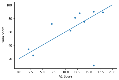
This line corresponds to the (estimated) model . While it looks somewhat promising, we don’t actually know if this is the line that best fits our data.
Common methods to find the best fitted line includes Least Squared method, and Gradual Descent method. Least Squared method will be covered in the next post.